
BRANDING CASE STUDY · APP TRADUCCIONES
Translating trust.
Designing belonging.
A new visual identity connecting a professional, legal and sworn translation agency with people who need help with official paperwork.
DEVELOPED IDENTITY
Client
APP Traducciones
Discipline
Branding & visual identity
Creative direction
Dany Domínguez · Astrohue
Project document
Visual identity manual · 34 pages
01 / THE STARTING POINT
An important service.
An identity to bring together.
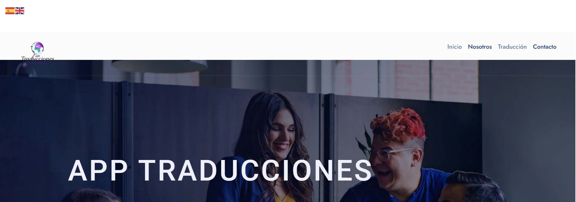
The previous identity combined a multicoloured globe, different typographic styles and visual elements that varied between sections. The website presented the services, but the brand had room for a more consistent expression and a clearer connection with its audience. The branding challenge was to bring those elements together.
BEFORE / PREVIOUS LOGO

AFTER / NEW IDENTITY
02 / THE IDEA
Origin as a connection.
Clarity as a language.
The manual places customers from different African countries, particularly French-speaking countries, at the centre of the brief. The silhouette of Africa expresses origin and a connection with their documentary journey. It does not stand for a single language or a single culture.
The supplied research references explore Adinkra symbols and geometric compositions. In the final identity, the focus is a system of shapes, lines and modules that can extend from the logo to other touchpoints.
01
Precision
A geometric structure expressing order and care.
02
Approachability
A professional brand supporting people, not just documents.
03
Consistency
A recognisable language from a business card to a digital concept.
03 / A SYSTEM BEYOND THE LOGO
Designed to remain
recognisable.
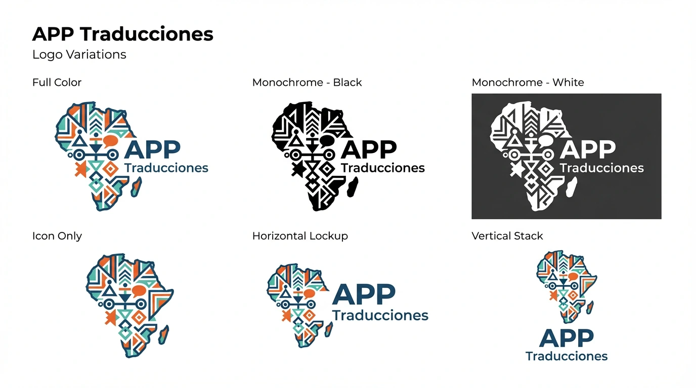
The manual defines construction, proportions, clear space, minimum sizes and correct usage. Full-colour, monochrome, horizontal and vertical versions allow the right composition to be selected without reinventing the brand for each format.
04 / COLOUR AND TYPOGRAPHY
Confidence, energy
and room to breathe.
Deep blue anchors the identity; orange and turquoise introduce contrast. The light background organises information and gives the message space.
#0F3D56
#F58733
#FF8A3D
#27B3B2
#F5F7FA
Poppins
Headings and primary typeface
Open Sans Bold
Typographic accents
Roboto Condensed
Body text and longer content
Typeface families and roles specified in the brand manual.
05 / FROM CONCEPT TO APPLICATION
The same brand.
At every encounter.
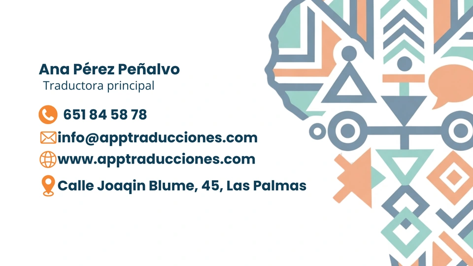
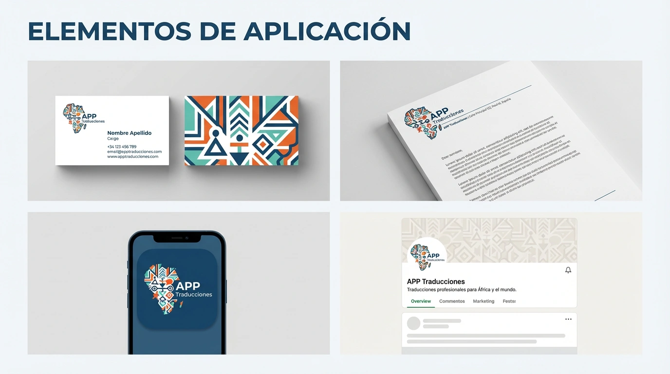
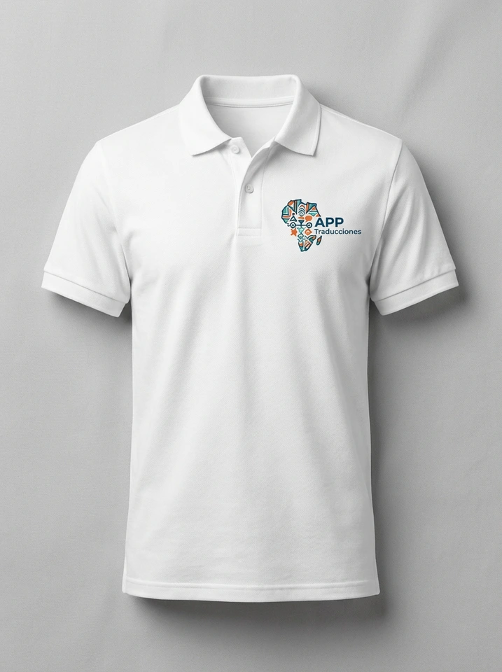
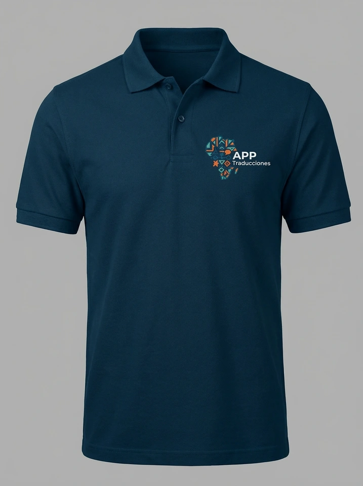
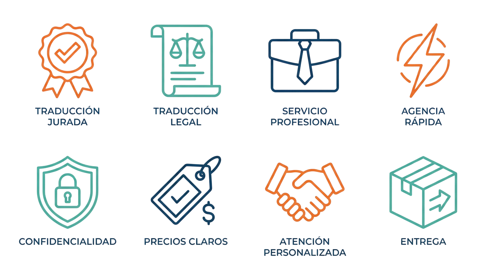
The project includes applications for business cards, stationery, uniforms, merchandise and email signatures. The graphic system creates continuity between pieces, while the iconography helps distinguish services and attributes without overloading the layout.
06 / DIGITAL DIRECTION
An identity that also
organises the experience.
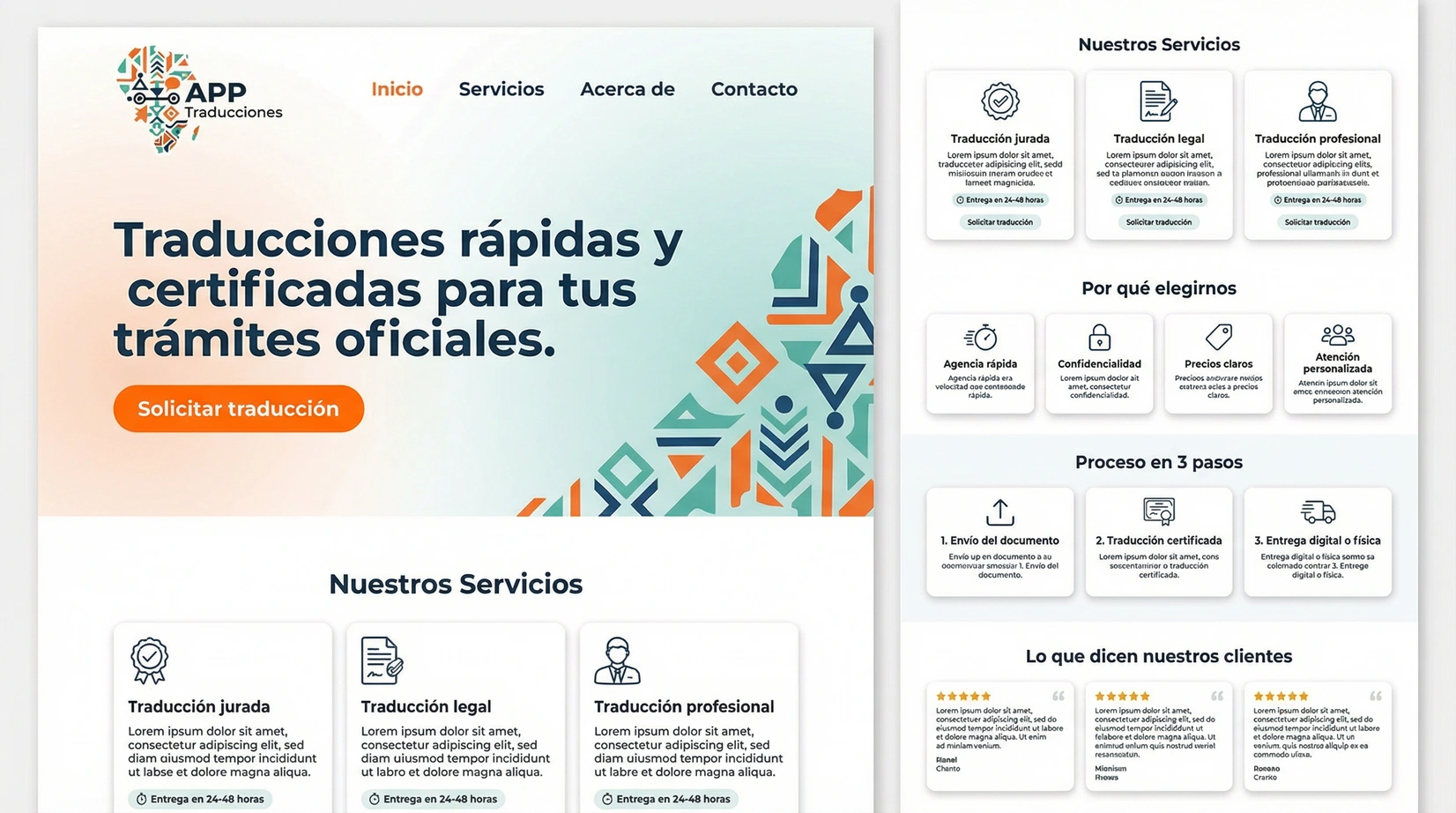
The website mockup in the manual shows how the new brand can inform a hero, a service catalogue and a contact journey. It is presented here as a visual concept: it contains sample copy and testimonials and does not demonstrate an implemented website or conversion results.
07 / WHAT THE PROJECT ESTABLISHES
A shared foundation
for clearer communication.
The deliverable documents a recognisable identity, its variants and application rules. The value of the project lies in connecting audience, message and visual expression, and providing a reference that helps future materials remain consistent.
The manual also specifies editable business card, letterhead and email signature templates, designed to support text updates while preserving the identity.
BRANDING WITH CONTEXT
Does your brand express
who your business is?
Let’s connect your audience, your proposition and the way you present your business.
